Our font and colours play a key role in our brand imagery and help to identity who we are and which of our priorities we are communicating about.
Headings
Font: Roboto Light
Headings should appear in upper and lower case, not all in capitals.
Roboto is an open source google font and can be accessed here: https://fonts.google.com/specimen/Roboto
Body copy
Font: Arial regular
For clarity and accessibility, body copy should be a minimum of 14pt.
Our colours
Primary colours
These colours are used primarily in most of our communications.

CMYK: 53/76/21/36
RGB: 107/62/100
Web: 6A3D63
Pantone: 268 C

CMYK: 84/0/67/30
RGB: 01/129/73
Web: 00815C
Pantone: 354 C

CMYK: 25/0/21/0
RGB: 204/229/214
Web: CBE5D6
Pantone: 2253 C
Secondary colours
These represent our priorities and should be used when communicating a message linked to them.
Community Wellbeing

CMYK: 0/89/27/0
RGB: 232/54/114
Web: E73571
Pantone: 807 C

CMYK: 11/72/4/0
RGB: 219/102/159
Web: DA669F
Pantone: 238 C

CMYK: 0/27/24/0
RGB: 250/203/189
Web: F9CBBC
Pantone: 2337 C
Environment

CMYK: 85/30/55/17
RGB: 8/119/111
Web: 07766F
Pantone: 2244 C

CMYK: 56/0/53/0
RGB: 124/194/147
Web: 7BC193
Pantone: 338 C

CMYK: 32/0/29/0
RGB: 188/221/197
Web: BBDDC5
Pantone: 332 C
Prosperity

CMYK: 0/66/80/8
RGB: 223/107/55
Web: DF6B36
Pantone: 1758 C

CMYK: 0/51/38/0
RGB: 243/152/142
Web: F2988D
Pantone: 2239 C

CMYK: 0/19/44/0
RGB: 253/215/158
Web: FDD69D
Pantone: 155 C
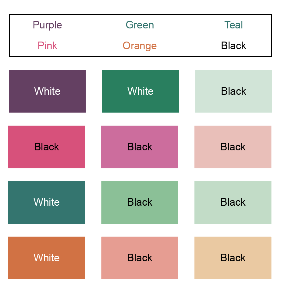
Colour combinations
We recommend the following combinations to ensure the contrast between the background colour and the text is accessible for all.
For digital documents, we need to meet the required WCAG 2.1 guidelines:
- Text must have a minimum contrast ration of 4:5:1
- For large text (18pt or 14pt and bold) the contrast ration must be at least 3:1
You can use a colour contrast checker to check the contrast ratio.